Fabric Design System
Rival
Key Contributors:
Cory Roth
Chris Wang
Narbeh Dereghishian
Hari Ramachandran
Summary
Fabric is a Design System (FDS) built by the designers at Rival for the purpose of enforcing quality while building with speed. It allowed us to build a fairly large product with a lot of hands on deck with a common language of patterns. This initiative was began a year into the start of the company, and a month after Design started laying down the groundwork, we brought in the Front End (FE) development leads to make this a collaborative effort. They would go on to build the Rival React Components (RRC) which would be the mirror image of FDS written in code. This elevated the relationship between design and engineering and dramatically sped up the pace of development.
Speed for design, Speed for build.
Less time thinking about how to build something, more focus on what.
Consistency within Design, Engineering, and between Design & Engineering.
Consistent naming conventions, build process, colors, styles, etc.
More efficient Designer to Developer handoff.
The “Magic” is baked in. By this we mean transitions and micro-animations that bring joy to a product.
Novice users or non-designers can now build UI, allowing Design to focus on more challenging areas.
Be able to build interfaces with nothing more than a spec doc & a napkin sketch.
Rival’s Design Principles
These are the set of considerations that form the basis of any great Rival product.
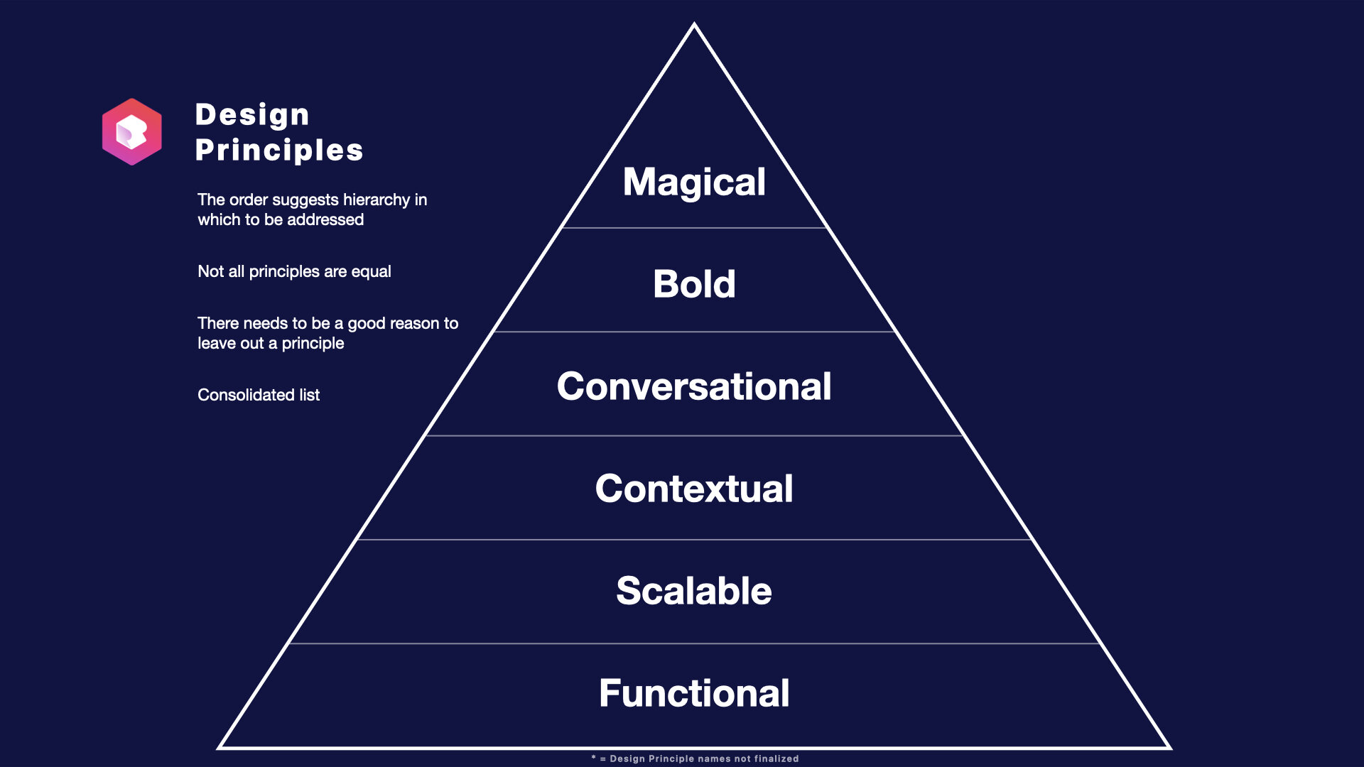
Why use Design Principles?
They fill a functional role in the design process.
Design Principles help teams with decision making.
They act as a guide toward reaching a successful design.
Or assessing where a design is falling short.
Consistency & Alignment across the team & product.
Building Blocks
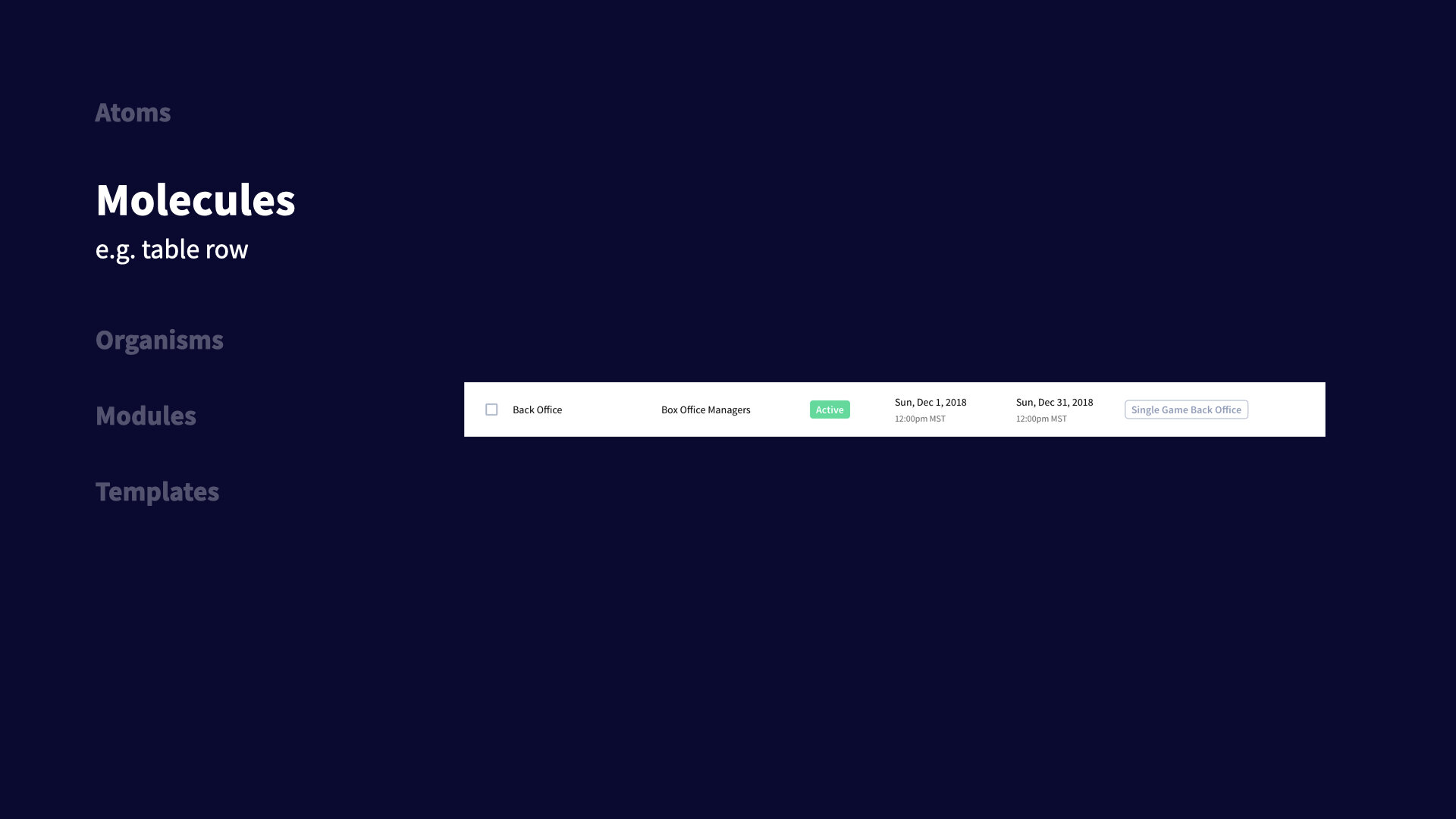
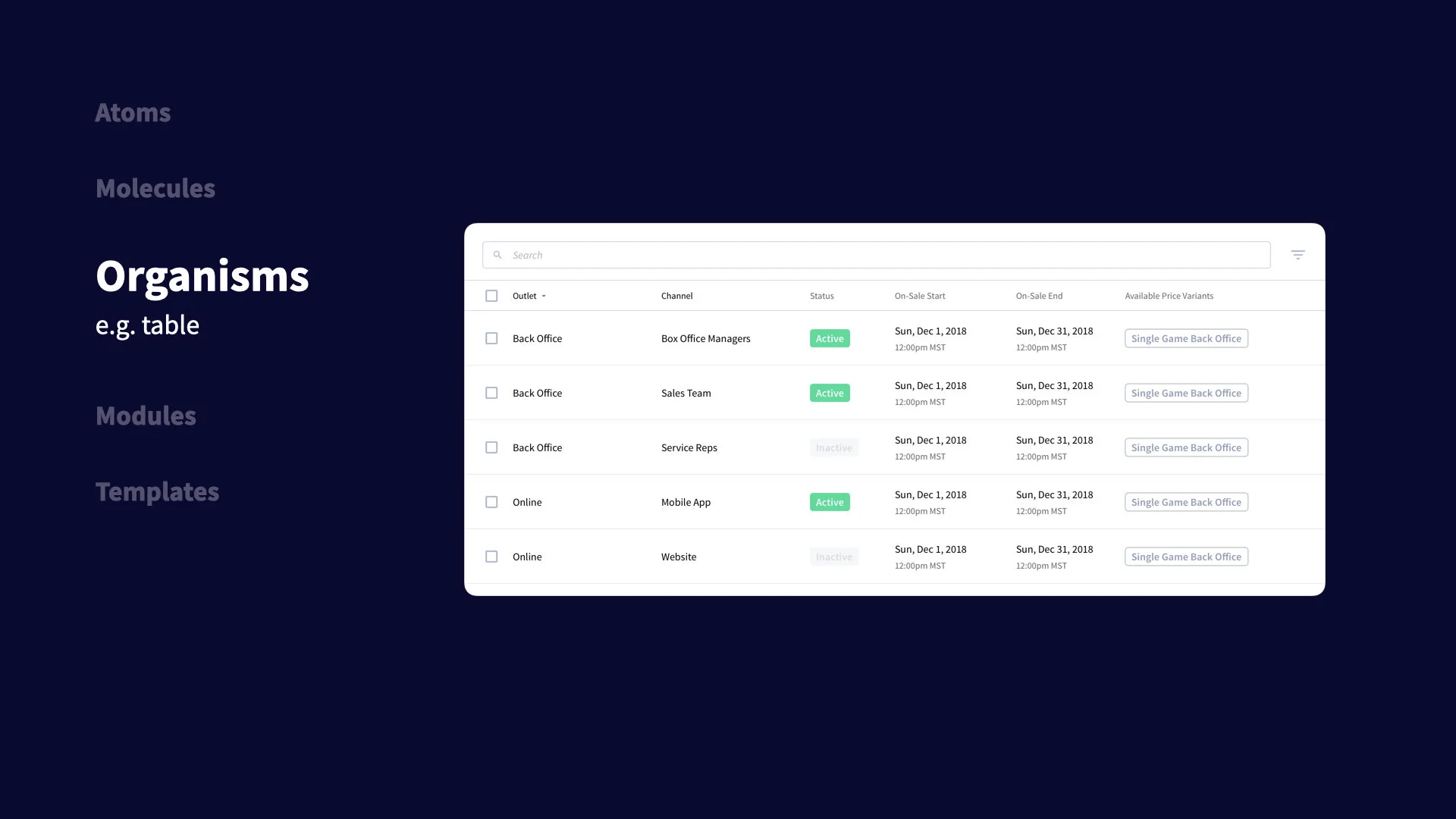
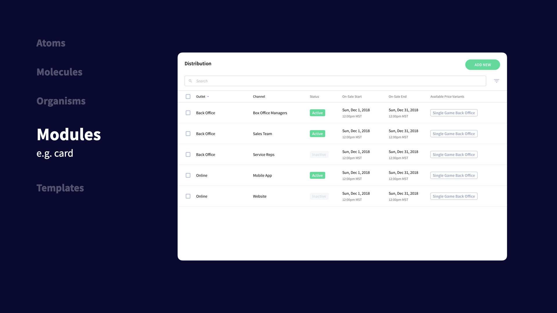
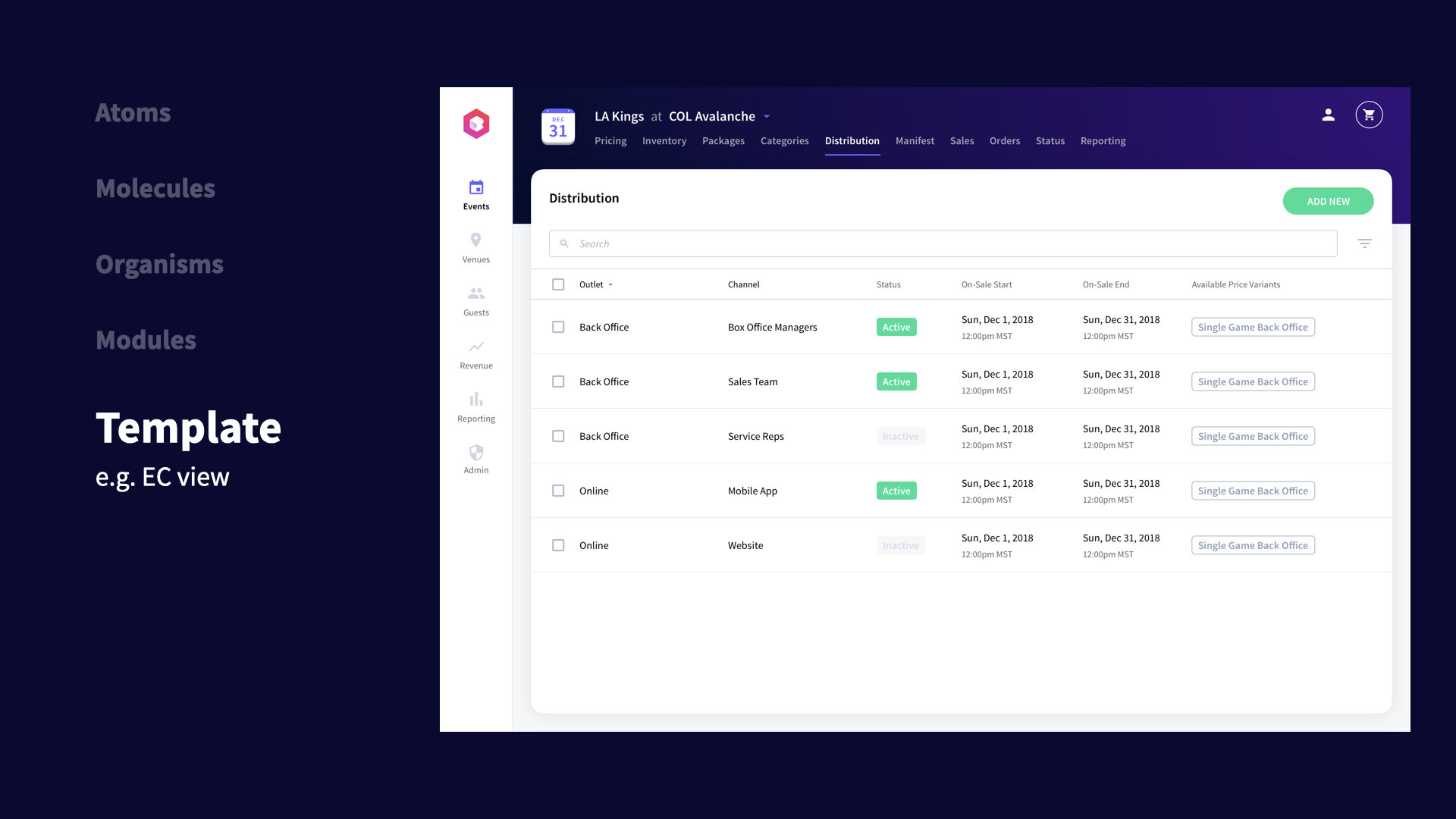
Atomic System
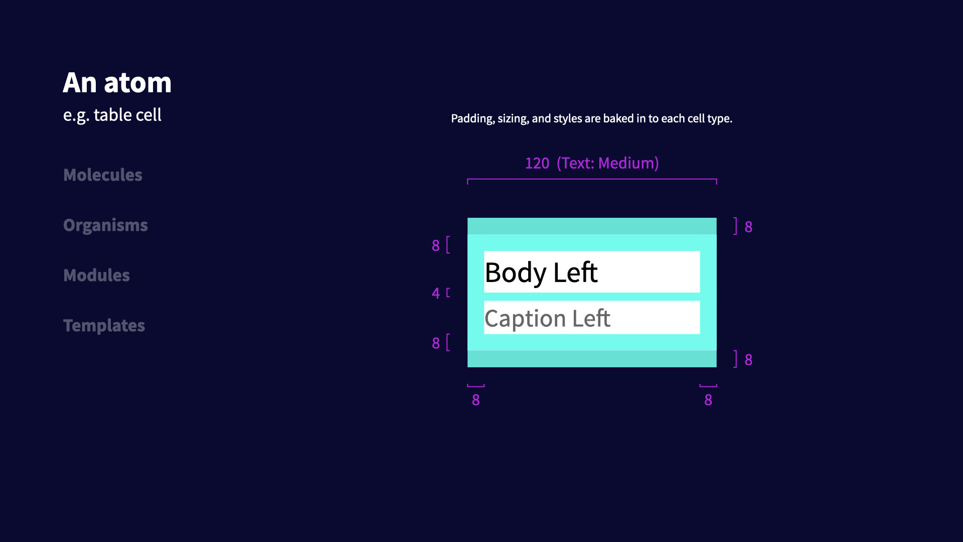
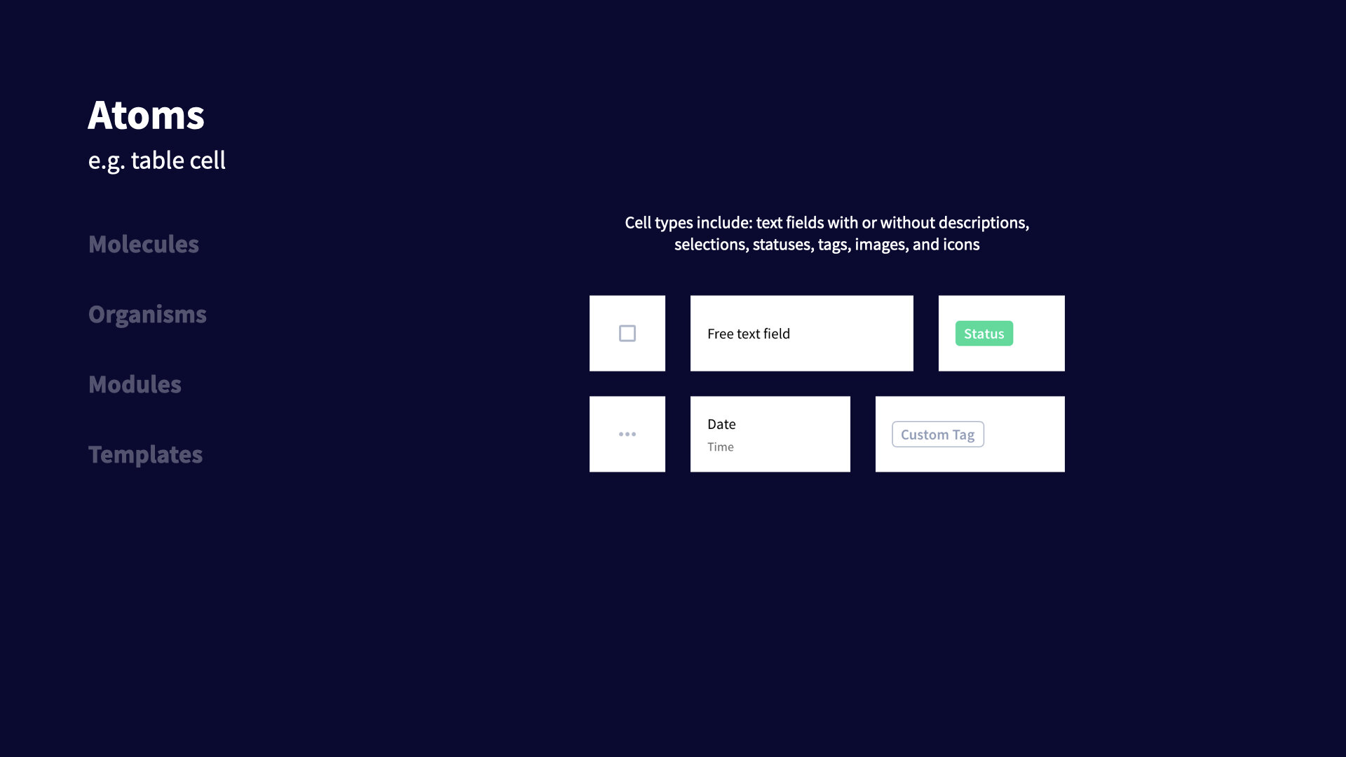
Atomic design systems have been along for a while, but the key is finding how it adapts to your design organization and design system. A few of the things we had to consider when building ours:
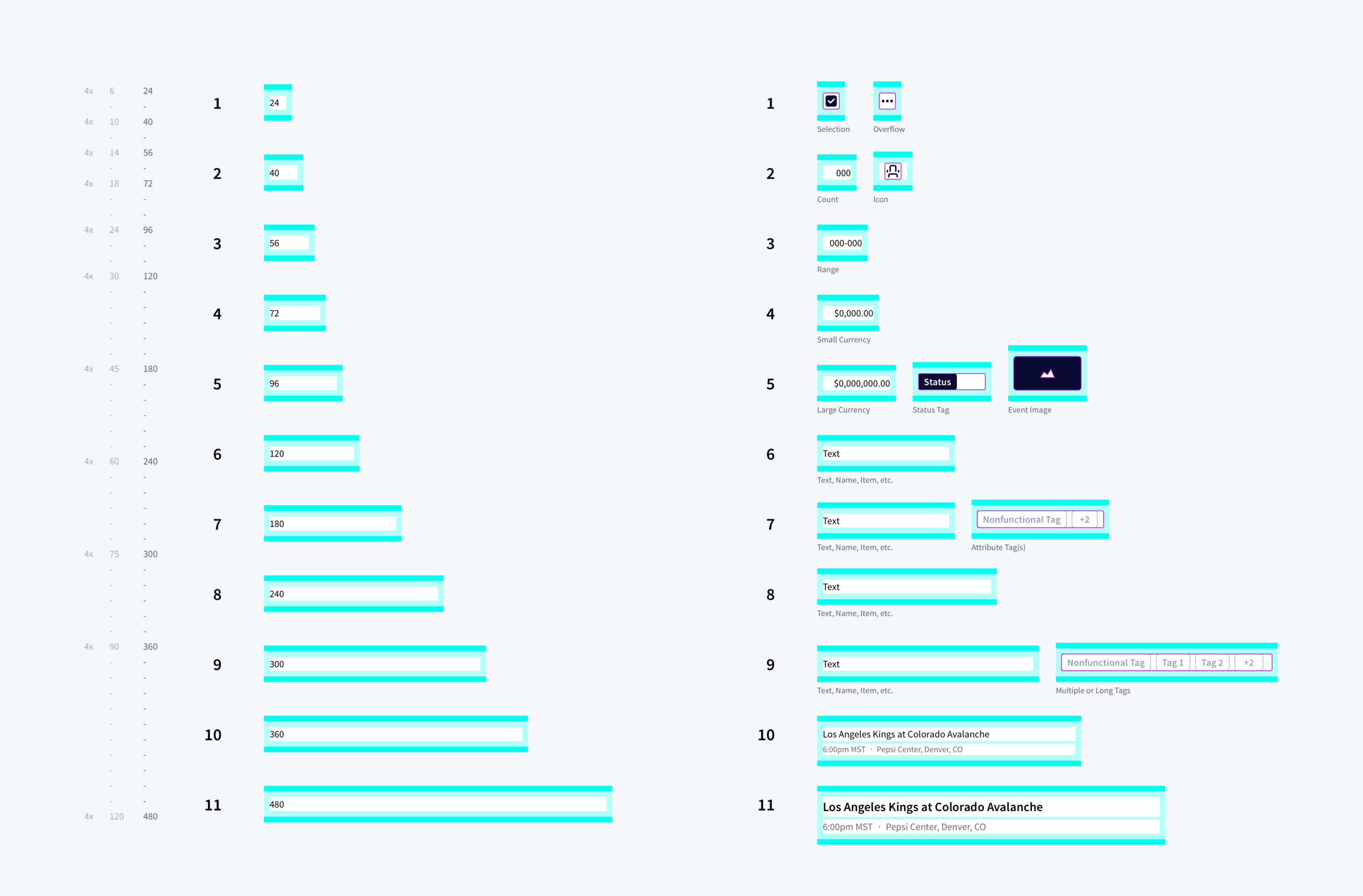
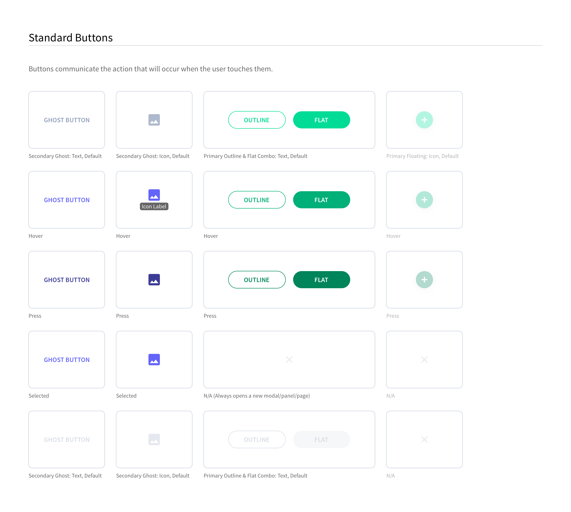
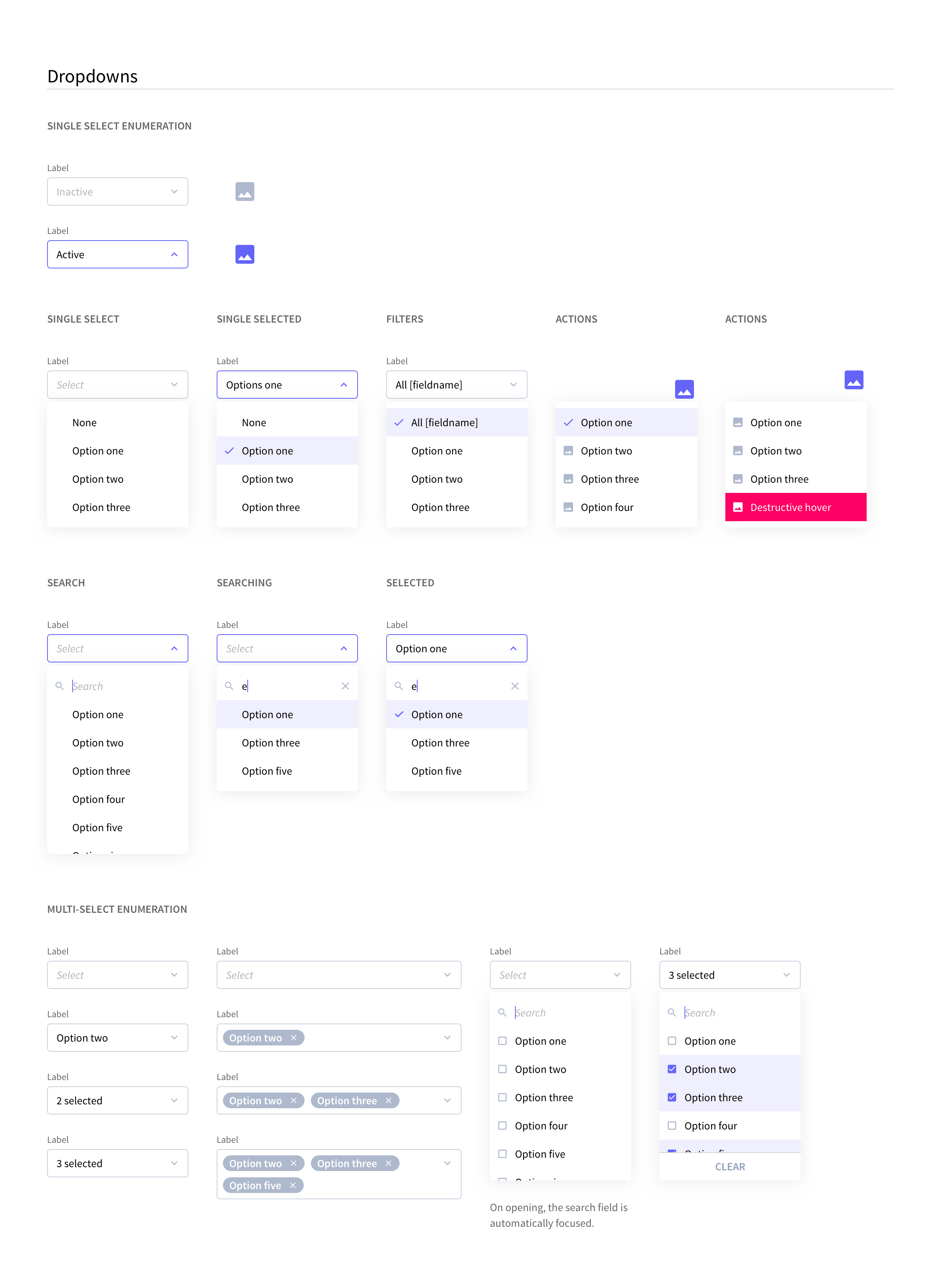
Define what an “Atom” is. The smallest building block is probably the most important one to establish. For example, some design systems establish a button to be an atom, but some of the properties of the atom are also atoms (colors for example.) While other design systems will go as far as to establish Buttons down the smallest detail, and call that an atom. Depending on which way you go, you might establish more constraints for your team gaining consistency, or give them or room for exploration.
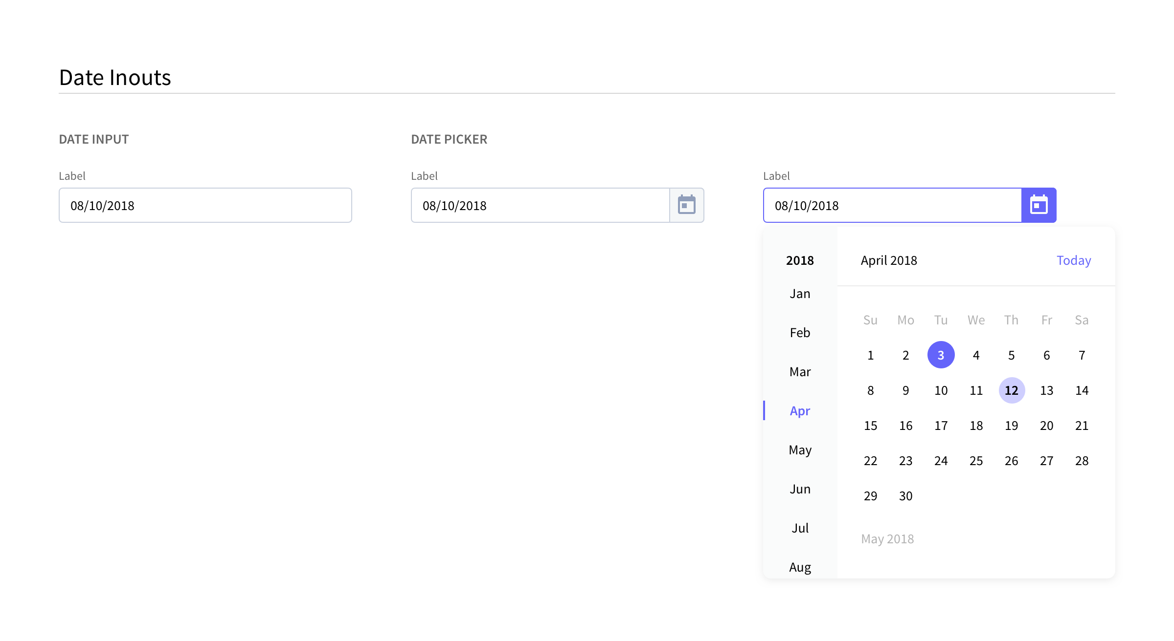
Defining the higher level components (“Modules”, “Templates”). At what point is a design far enough along where it is considered a template (where content is filled), and at what point is it just another layer. At Rival we later added a concept of “Scenes” and “Pages” because we noticed that if a designer was building a standard data table with a header and action panel, this is beyond a “Module” and yet it is still before a “Template”
We also agreed that this is something that would evolve and we should revisit from time to time to see if the structure we’re following is still serving our needs.



Rival Custom Icons
An object of affection
There are two points of pride for design teams that few others will understand. The day they design their own icons, and the day they design their own typeface. At Rival we were able to do the former. Our very talented designer, Chris Wang, designed each icon with a tremendous amount of consideration and care. We’d often time plug in an icon and see how it feels within our platform before approving it.
SKETCH LIBRARY WORKFLOW
optimizing workflow for efficiency
After we had established our design system, it was time for our workflow and process to change. At the time we were still using Sketch (we’ve have now moved onto Figma). Most design software now give organizations the ability to build symbol libraries and a way to access them directly from within a workspace. Long gone are the days of copy/pasting from an external doc into the one you’re working in. The nuance here is there is there are many ways to implement a design system into a library. The variables exist in how components are categorized, grouped together, and nested. An organization can create a taxonomy system that is heavily nested, and though this may seem highly organized, it makes finding components an arduous task. It also isn’t a great idea to leave all components at a surface level because then sifting through them becomes a “Where’s Waldo” exercise for symbols. The balance is somewhere in between. Above is one of the iterations of the library workflow.
Sketch Library workflow v.03
Rival React Components - “Kitchen Sink”
The Kitchen Sink is the final step of RRC. It is an internal site that can be accessed by anyone in the company to check component guidelines and specifications, as well as the ability to grab code directly from the page. It also allows a user to demo the components to see their behavior before deciding to pull them into a design.
