Maker Studios
Acquired by
The Walt Disney Company
The opportunity..
Maker Studios needs a way to broker deals between major brands—such as Sephora, Coca-Cola, Pixar, and many more— with its 50,0000 YouTube talent and Instagram influencers. This service must be an automated and self-serve, it must provide real time performance metrics, and reduce bad posts due to quality issues (aka typos).
My Role
I was brought on as the UX/UI Lead for the Maker Offers project. The team responsible for this project was comprised of two product managers, a senior UX designer, and seven software engineers and quality assurance engineers. This project was originally designed to be responsive web platform that would allow us to reuse our existing backend, in order to get the product out sooner. As soon as the web version was completed the team realized a mobile app was necessary, which would no longer make use of the existing backend framework.
Final Designs
Transitions & Micro Interactions
Quality Posts = More money
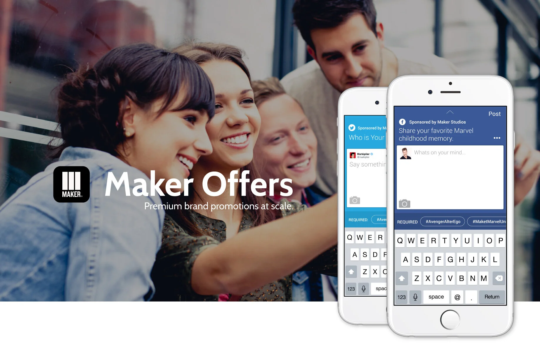
What you see here was my solution to reducing typos and errors when creators would write posts. The most important part of these posts was to get the hashtags and links right. So instead of giving creators a script, we allowed them to write their own unique content, but to simply tap these Hashtag buttons to populate the correct hashtags.
The Brief
Offers connects top brands, such as Pepsi and Disney, with Talent to allow premium sponsored deals. These deals are usually promotions that the talent will do on the platforms they are most popular on. For example, a talent might be paid to do a tweet and talk about their most memorable trip to Disneyland.
Maker Offers was built once in 2013, and was severely in need of a redesign. The product itself wasn't intuitive, and everyone from talent to internal stakeholders had pain points. The product's experience was impeding the growth and potential of such an innovative model.
Business Goals
Increase organic participation in Offers.
Reduce the number of steps required to complete an offer.
Increase traffic to Offers tool.Improve quality of Offer listings.
Reduce the number of support tickets in relation to Offers.
Make the product more intuitive and give confidence to the talent in knowing what stage they're on in an Offer, and if they met all the requirements.
Reduce the number of rejected offers due to user error or missed requirements.Provide a responsive mobile.
Where we started
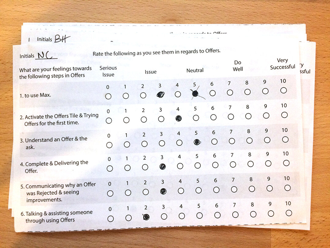
Discussion Guide used
Discussion guides are meant to be general reminders for points to hit during an interview. They are not meant to be used as a script. During an interview, it is common for respondents to fall outside guideline, and hit points that should be explored further. It is up to the moderator to know when to follow the tangent and customize the interview to the respondent, and when to pull back and follow the script.
Key findings
Usability
Maker Max was used around once a week (average 2.5 - 3 minutes).
Deadlines were confusing.
Analytics seem helpful but confusing.
Expansion of social media types.
Want KPI on why some videos are watched more than others.
Data on things such as hashtags.
Guidance on thumbnail creation and types of fonts.
Trends are too broad.
Help mid-talent determine what the key takeaways can be from the analytics, have some type of group session with other talent to help each other with videos (intros, timing, transitions).
Having a mentorship program.
Networking with other Talent is difficult. Try and find a way to network with other Talent.
Mid-Talent are not sure how tools such as Social Blade or anything with Insights would help them.
Notification system (logins, messages, alerts).
Promotions & Product
Some deals do not pertain to the right talent.
Confusion over the descriptions when explaining how to submit an Offer task.
Requirements were confusing.
Process to submit seemed chaotic.
Not clear on creative freedom because of requirements.
No mobile, if there was possibly some type of Maker App.
Epoxy tool from epoxy.tv is helpful.
Uploading videos and thumbnails were vague.
Too many emails. It became confusing.
There are no newsletters about Offers.
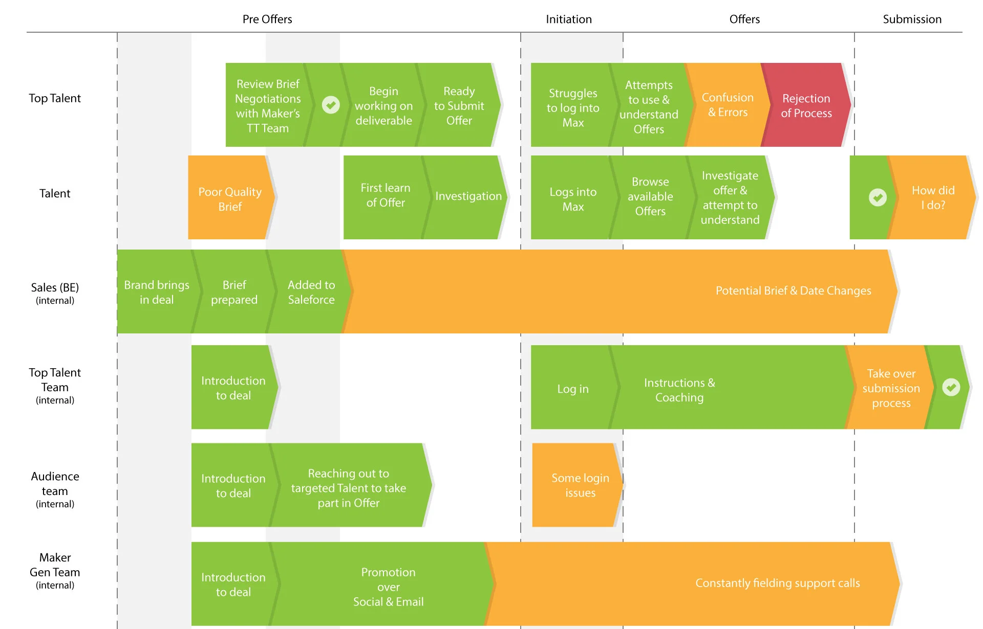
In general, there were a lot of pain points that could be linked to communication breakdowns, changes in briefs, and lack of effort in one department would effect another's ability to execute much further down in the process. We soon realized that there would need to be much more then a product redesign, but in addition we'd need a redesign for how our organization creates and manages offers, as well as how they support talent who choose to participate.
Redesigned Operations Flow
Offers Redesign: Phase 1
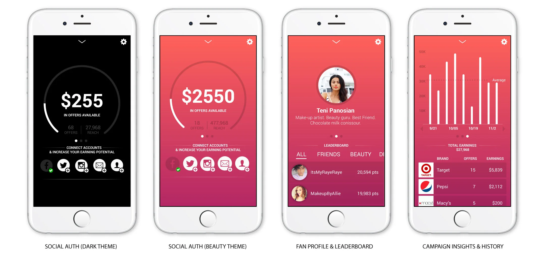
We successfully redesigned Maker Offers with a clean, minimal aesthetic that showcased each offer by earning potential and the tasks they required. This was a major success, and addressed all the goals for the redesign. The design was also responsive with parallax banners and looked like the modern upgrade the talent and our internal stakeholders were looking for.
The Fate of The Creator App
This became the mobile web approach until the native version called “Creator App” was built (screens from the top). Maker Offers did fairly well at Maker Studios, and was a big tool even internally for launching activations. Creator App didn’t have as long of a run as it was launched months prior to Disney shifting strategy and deciding it only wanted to maintain its contracts with the top 200 creators. Once the 50,000 remaining creators were dropped, there no longer was a need for a self-serve tool.


